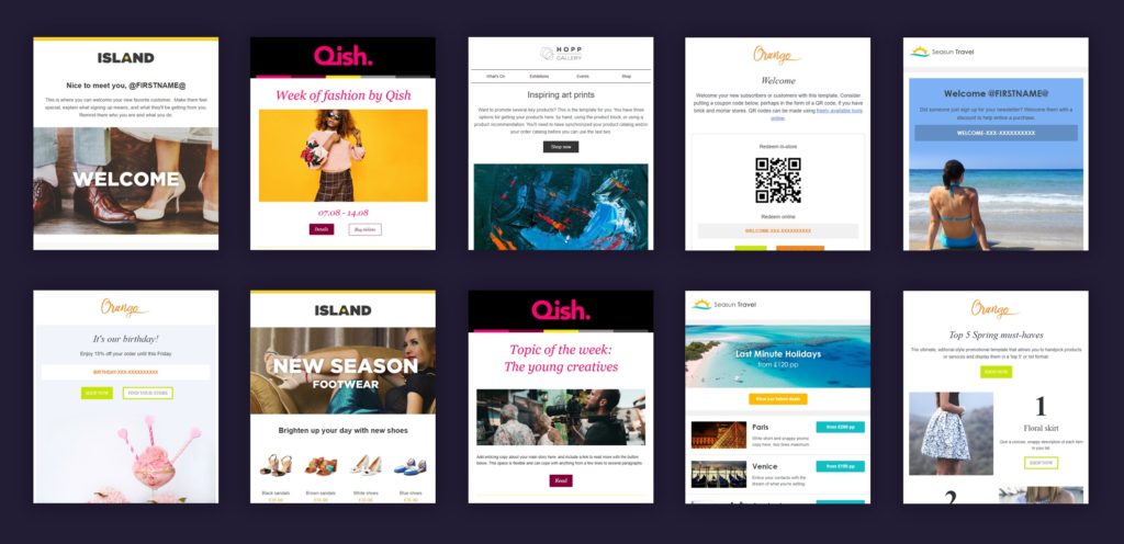
10 ways to improve your email design


In today’s digital marketing landscape, a well-designed and engaging email can make all the difference in driving conversions and nurturing customer relationships. An exceptional email design not only captures the attention of your audience but also compels them to take action. So, how can you achieve this high level of design proficiency? Here are 10 actionable tips to elevate your email design game.
1. Embrace simplicity
Make sure your emails are easy to read by avoiding cluttered layouts. Keep it simple by removing unnecessary elements, using a single-column format, and using clear headings. Use colors that work well together and organize your content to make it easier to understand. Break up your content into shorter, easy-to-digest chunks that your readers can quickly scan through.
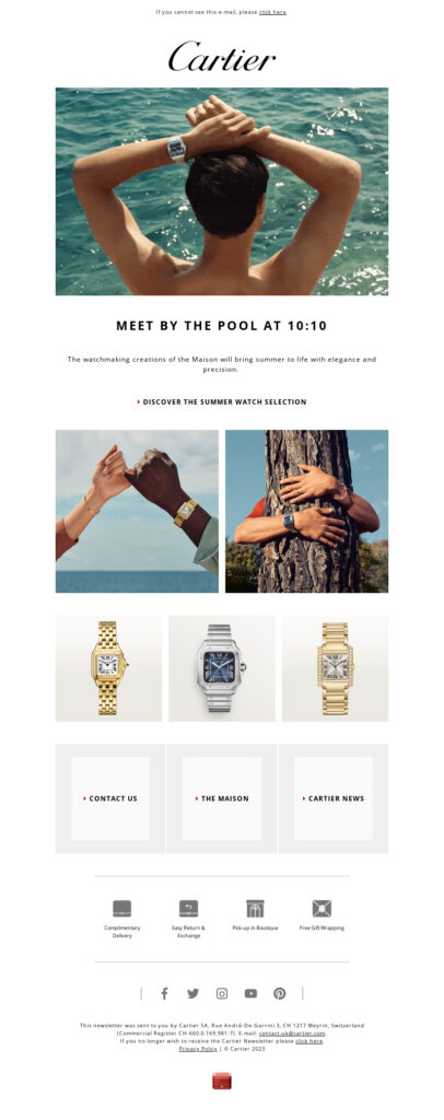
2. Consistent branding is key
To build trust and recognition, make sure you keep things consistent in your email designs. Stick to your brand’s colors, logo, and typography so that your emails become an extension of your overall brand identity. This will help you establish stronger connections with your subscribers. Consistency in branding also shows professionalism and attention to detail.

3. Maximize white space
White space is more than just a design element – it plays an important role in enhancing readability and organizing content. By incorporating sufficient white space around headings, paragraphs, and other essential elements, you can create a visually pleasing layout that directs the reader’s gaze through the email. This approach not only makes your content more captivating and effortless to navigate, but it also alleviates any sense of overcrowding, resulting in a more relaxed and pleasant reading experience.
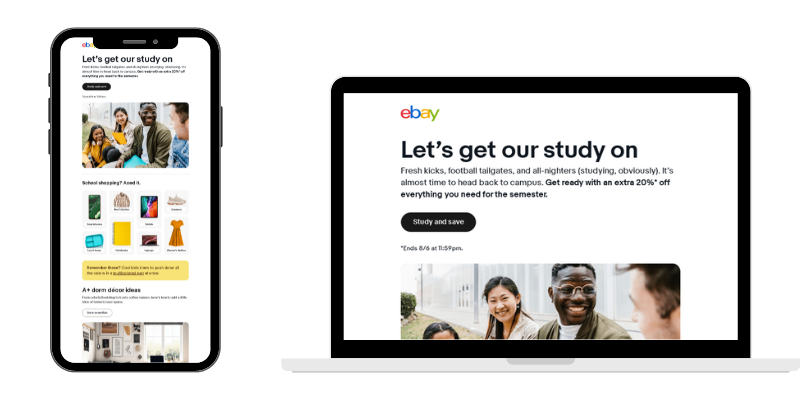
4. Optimize for mobile devices
In today’s world, people tend to check their emails on smartphones, which makes it crucial to design responsive and mobile-friendly layouts. To optimize for mobile devices, it’s important to adjust font sizes for smaller screens and ensure that buttons are easy to tap. Testing the email on different clients is also necessary to ensure a seamless experience. Additionally, compressing images and keeping email file sizes small can facilitate faster loading and prevent reader frustration.
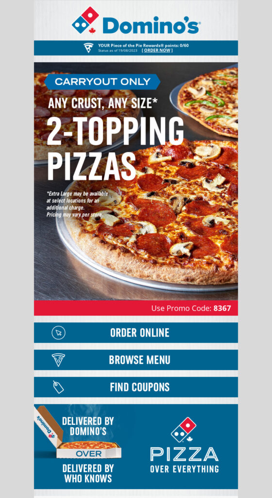
5. Use clear and distinct CTAs
It’s essential to pay close attention to the call-to-action (CTA) buttons in your email campaign, as they can have a significant impact on its success. Ensure that your CTAs are visually appealing and easy to spot, with a clear message. You can try out different colors, sizes, and positions to see which configuration works best. Also, use persuasive language that encourages your readers to take action, without coming across as overly sales-oriented.
6. Prioritize accessibility
Creating emails that are accessible to all users, regardless of their abilities, is not only ethical but also practical. To achieve this, prioritize features such as using a font size that is easy to read, ensuring high color contrast, and including descriptive alt text for images. By making your designs accessible, you can increase engagement rates and reach a more inclusive audience, preventing anyone from feeling left out of your message.
7. Choose visual elements wisely
To make your emails more attractive, consider adding high-quality images and graphics that match your message. Be careful not to let visuals overpower the main message. Also, optimize images for faster loading and ensure they display correctly on various email clients and devices.
8. Leverage personalization and dynamic content
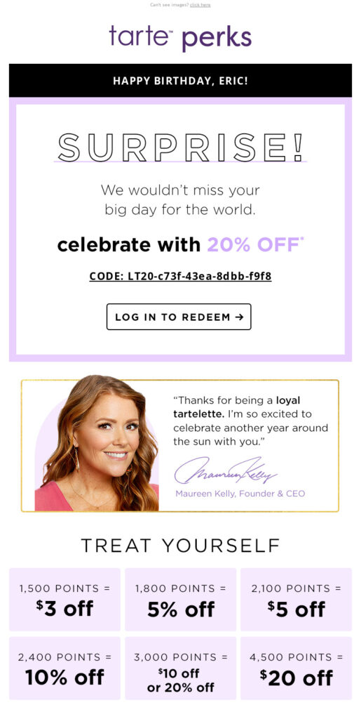
Leveraging personalization for each recipient can greatly increase their engagement. By incorporating user data, like their name, location, browsing and purchase history, you can personalize subject lines, text, images and recommendations. Utilize dynamic content to tailor emails based on subscriber preferences and behavior, resulting in a more relevant and captivating experience.
9. Test and refine your design
To ensure maximum engagement and conversion rates, it’s important to regularly assess your email designs. A/B testing can help you compare various aspects of your emails, from headlines to CTAs to layout options. Analyze the results to spot any trends and fine-tune your designs accordingly. Remember, consistent improvement is essential to stay ahead of competitors and maintain strong relationships with your audience.
10. Animated GIFs and interactivity
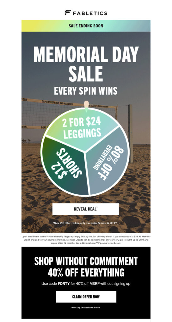
Enhance your content with animated GIFs, countdown timers, and interactive elements such as forms and surveys to engage your audience. It is crucial to ensure that these additions do not divert attention from your key message or compromise accessibility. Interactive content, when executed correctly, can add excitement and boost engagement rates.
Summary
By incorporating these 10 tips into your email design strategy you will grab your audience’s attention while also creating a long-lasting impression that builds trust and loyalty toward your brand. A properly executed email design strategy that focuses on user experience, accessibility, and engagement will enhance conversions and improve your customer relationships.


