Newsletters we love, why we love them, and how to recreate them


While some think newsletters are outdated, there’s no better way to engage audiences. A boring, unappealing newsletter is hard to digest and can affect your growth. Amazing, engaging newsletters (like the ones below) improve brand awareness and sales. They take your brand marketing to the next level. They boost your organic growth by encouraging readers to share content. Creating interesting content will boost customer engagement and subsequently raise retention.
We’ll be looking at the examples below, outlining why we love them, and how you can replicate yourself.
1.) theSkimm
theSkimm’s daily roundups are an inbox must. Targeting female millennials, theSkimm breaks down news stories into short, punchy paragraphs. It even helps readers understand complex topics with easy-to-understand guides on its website.
Why we love it
theSkimm understand the importance of social proof. The first CTA is at the top, well above the fold, encouraging readers to share theSkimm with friends. After that, it offers readers further chances to share on social, and repeats this at the end of every story.
It doesn’t need images to keep readers engaged. It knows its audience well and the copy reflects that. theSkimm keeps its tone consistent, no matter the topic. Its emotive style frequently leaves readers shocked, excited or laughing.
How to recreate it
1.) Know your audience. Once you know who you’re targeting, it should be much easier to develop your tone of voice and to keep it consistent. If you’re not sure, check out our content marketing worksheet which has all the tools you need.
2.) Social sharing. Make sure you’re utilizing Dotdigital’s social links block with every email you build.
3.) Reward loyalty. Encourage newsletter sharing by making it part of your customer loyalty scheme. Dotdigital partners such as LoyaltyLion and Antavo can help you create schemes that customers love.
2.) Patch
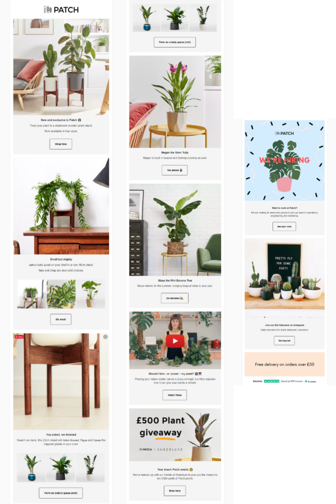
Helping you create your dream urban jungle; Patch brings the joy of gardening to anyone and everyone. It packs every email full of helpful and highly clickable content. On top of it all, its images and design are sleek and appealing to the eye.
Why we love it
Patch is the epitome of keeping things super simple. This newsletter is easy to scroll and perfectly uncluttered on mobile and desktop. Its use of white space between blocks and clean images makes it easy for readers to take in information.
We also love it’s fun CTAs. There’s no unwritten rule out there that says ‘Shop now’ is the best way to get people browsing. Personalizing each button to the block is an awesome idea.
Finally, if you’re not too distracted by Megan the Siam Tulip or Musa the Mini Banana Tree, Patch finish with a bang! From educational videos to competitions, Patch engages readers with a variety of content.
How to recreate it
1.) Less is more. Make sure your design is sleek, uncluttered and makes the most of white space. This is simple thanks to Dotdigital’s easy editor. Spacer blocks and image padding ensures your newsletters are clear and easy to read.
2.) Try something different. Experiment with your CTAs. Make them stand out by using bold colors or try something new with your copy. Whatever you do, testing is essential. By testing your CTAs, you can optimize your newsletter be the best they can be. For help getting started with testing, check out our testing worksheet.
3.) Mobile-ready. Never forget to test your emails to check they render correctly, no matter the device. All Dotdigital email templates come mobile-ready as standard.
3.) Fitbit
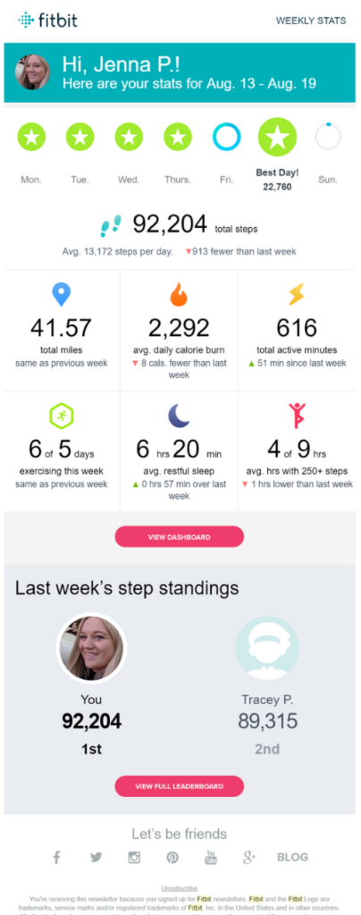
Fitbit shows its dedication to transforming people’s lives in their weekly newsletters. Aiming to empower and inspire, Fitbit uses data to deliver a personalized experience every week.
Why we love it
Easy – because it’s personal.
Fitbit are in a more unique position than most brands, as its products are designed to collect data. This gives them a wealth of data to work with. But it’s the idea behind it we love. Keeping people on track and connected to the brand using the power of data.
How to recreate it
1.) Keep it connected. The key to personalization is data, so wherever it’s stored, make sure your systems are synced. The benefits of this are endless, from breaking down silos to keeping data clean. With information at your fingertips, delivering personalized customer experiences is smooth and simple.
2.) 1-2-1. Never forget that it’s the little things that make the biggest difference. Basic personalization such as subscribers’ names and genders are essential and should be gathered from your first touch with customers.
4.) charity: water
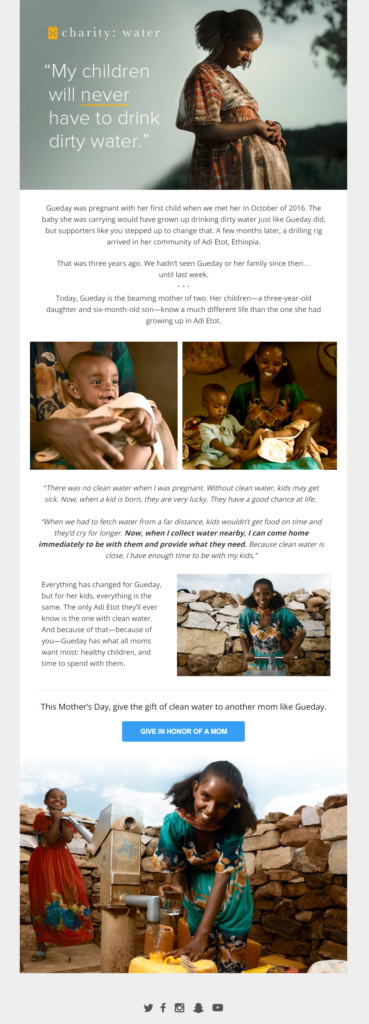
charity: water‘s mission is to bring clean, safe drinking water to developing countries. The newsletter targets supporters and proves the real impact donations can have. Short and concise copy, with a clear message and goal, helps charity: water achieve its mission.
Why we love it
Charities are shifting their tone to focus on the positive impact of giving. charity: water’s tone strikes all the right notes. It’s positive and affirming and sparks a desire to donate through the emotive story it tells. When people can see the genuine result of their generosity, they’re more willing to give.
Its design is simple and clean. It doesn’t over complicate its message and drive readers to one end goal – donating.
How to recreate it
1.) Storytelling. An emerging trend, telling your brand’s story is a quick, easy way to connect customers with your brand.
2.) Automate. Non-profits, in particular, can benefit from intelligent marketing automation. Programs such as customer nurture can help you tell emotive stories and boost donations.
3.) Attention-grabbing. Readers decide whether they’re going to read your email within 12 seconds. That’s why it’s so important to deliver essential, relevant information quickly. An eye-catching image and bold header is a good way to good.
Getting your newsletters right
Not to sound like a broken record, but newsletters are an invaluable part of your email marketing arsenal.
You need to carefully plan your sends to ensure success. ‘Content is king’ as they say, but without a slick design, your chances of being opened are low, and converting is even harder. You don’t have a lot of time to make an impact. Create a killer template and the content will follow.
I hope you’re feeling inspired to shake up your newsletter, but if you need a little more help, why not check out our 5 simple steps to awesome email design.


